INSPIRATION FROM LUCAS SIMOES:
|
|
|
|
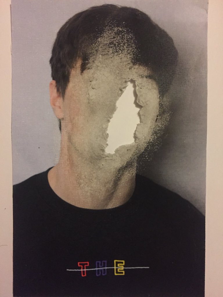
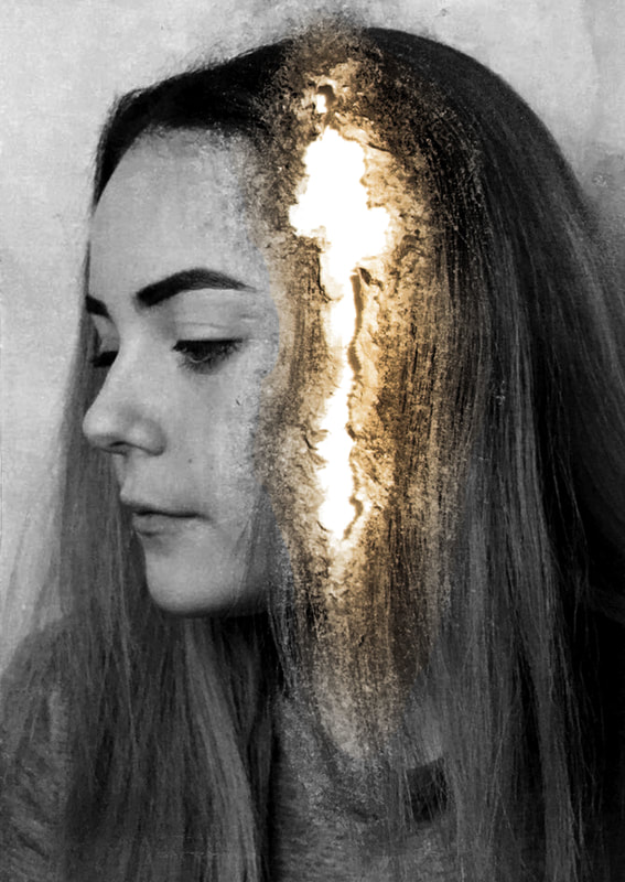
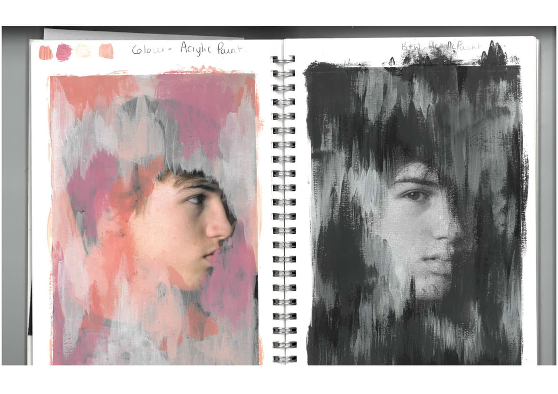
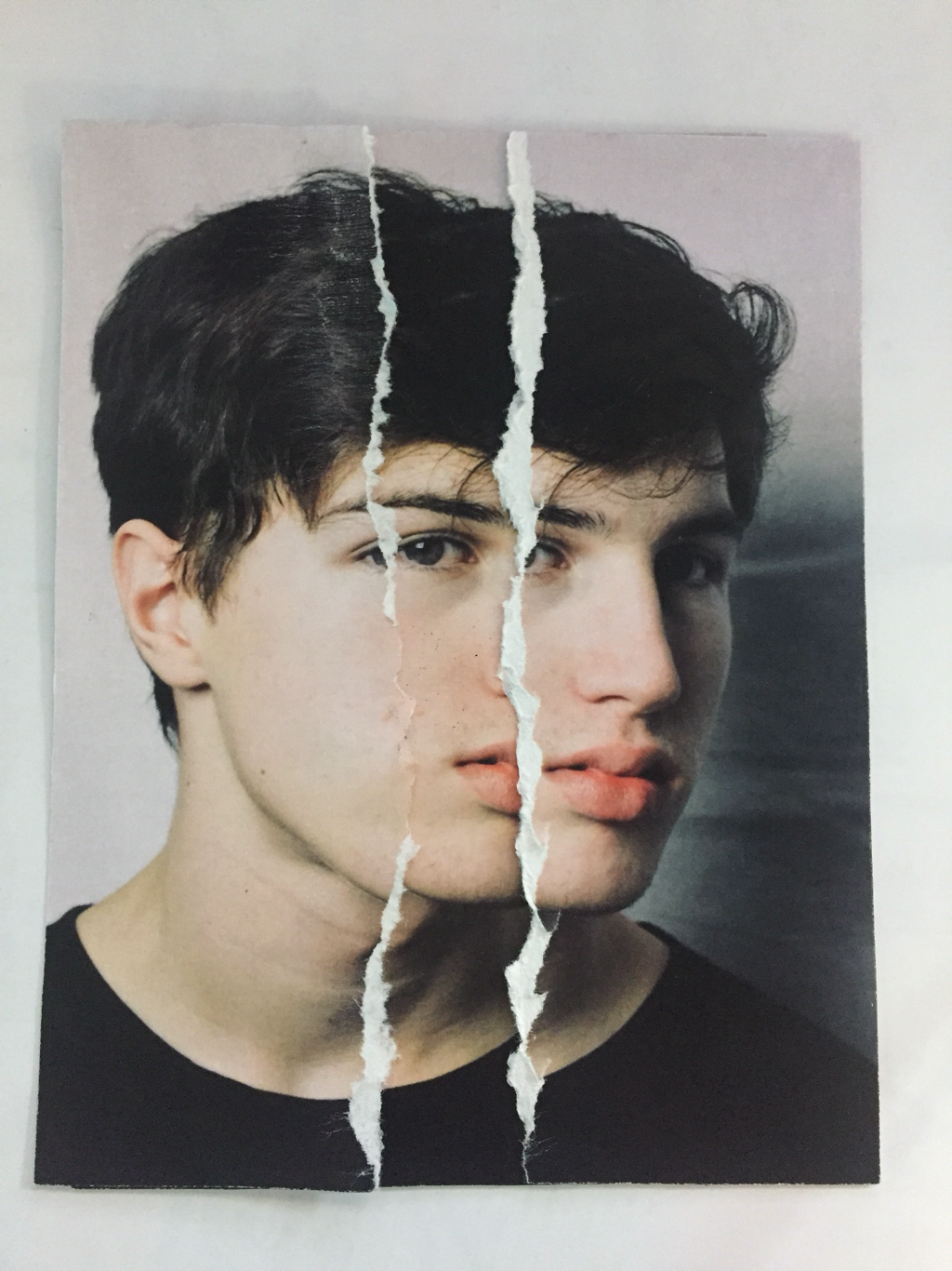
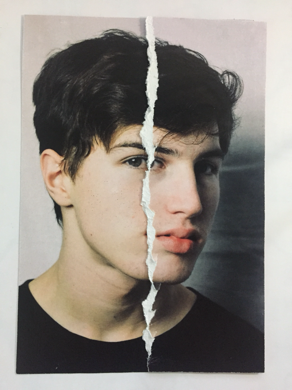
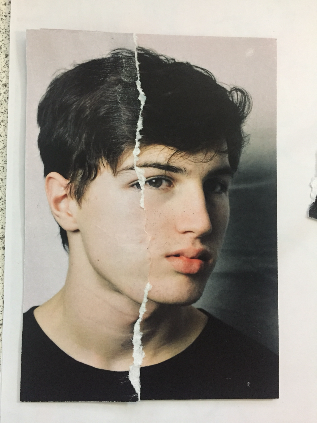
With taken inspiration from Simoes, I created this image.
I decided to print out an unedited image of one of my models. I then used bleach and a paintbrush to slowly disolve away parts of the paper and create a distressed effect, which eventually created a hole like many of Simoes' works demonstrate. I then scanned in the image back into photoshop and changed the colour of the whole image to black and white. After this I changed the colour around the rip to orange and adjusted the contrast and brightness to create depth and tone. A lot of Simoes' works include this colour. I then also overlayed an orange background to the entire image, making sure that the layer of orange around the rip had more contrast to the background. |

|

|
|
|

|
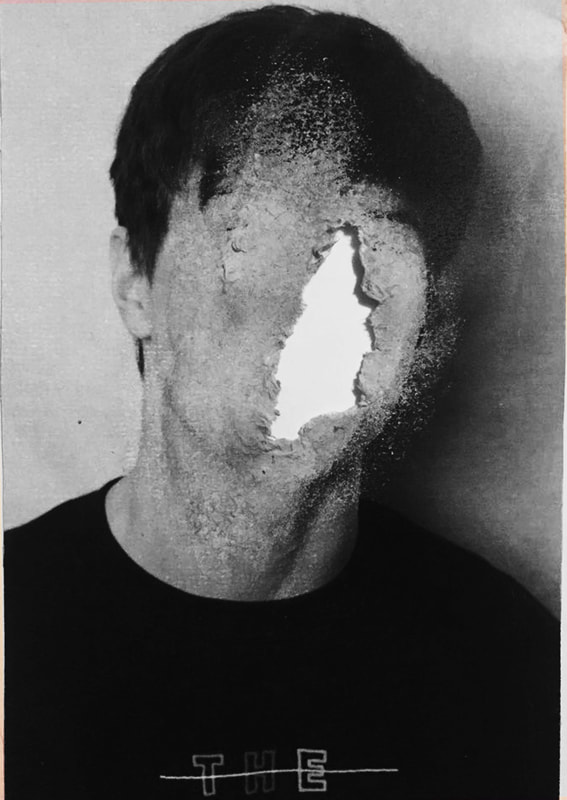
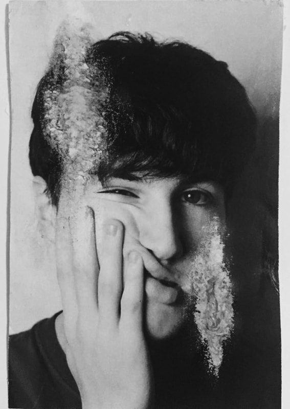
With taken inspiration from Simoes, I created this image.
I decided to print out an unedited image of one of my models. I then used bleach and a paintbrush to slowly disolve away parts of the paper and create a distressed effect, which eventually created a hole like many of Simoes' works demonstrate. I then scanned in the image back into photoshop and changed the colour of the whole image to black and white. After this I changed the colour around the rip to orange and adjusted the contrast and brightness to create depth and tone. A lot of Simoes' works include this colour. I then also overlayed an orange background to the entire image, making sure that the layer of orange around the rip had more contrast to the background. |

|
|
|
|
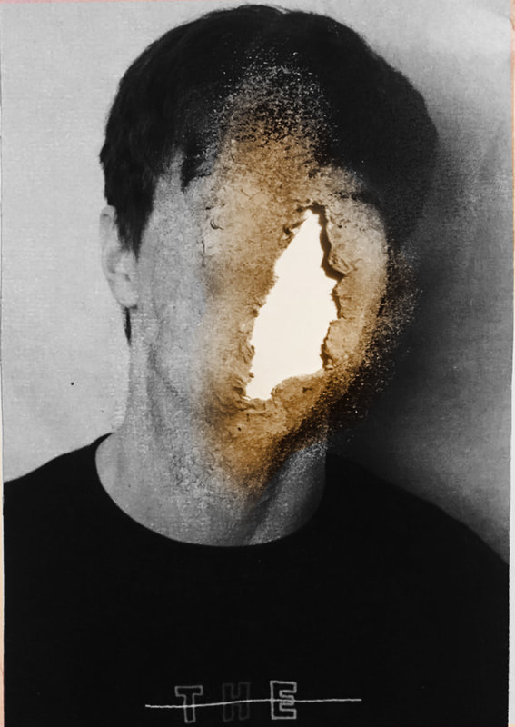
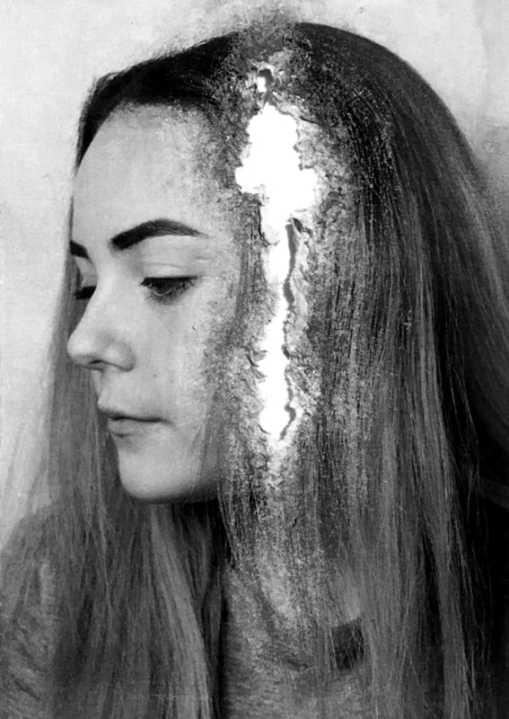
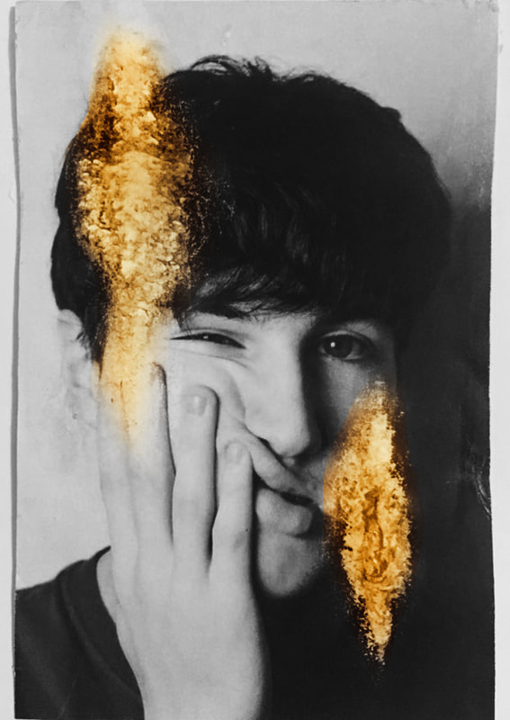
With taken inspiration from Simoes, I created this image.
I decided to print out an unedited image of one of my models. I then used bleach and a paintbrush to slowly disolve away parts of the paper and create a distressed effect, which eventually created a hole like many of Simoes' works demonstrate. I then scanned in the image back into photoshop and changed the colour of the whole image to black and white. After this I changed the colour around the rip to orange and adjusted the contrast and brightness to create depth and tone. A lot of Simoes' works include this colour. I then also overlayed an orange background to the entire image, making sure that the layer of orange around the rip had more contrast to the background. |

|
INSPIRATION FROM ROSANNA JONES:

|

|

|
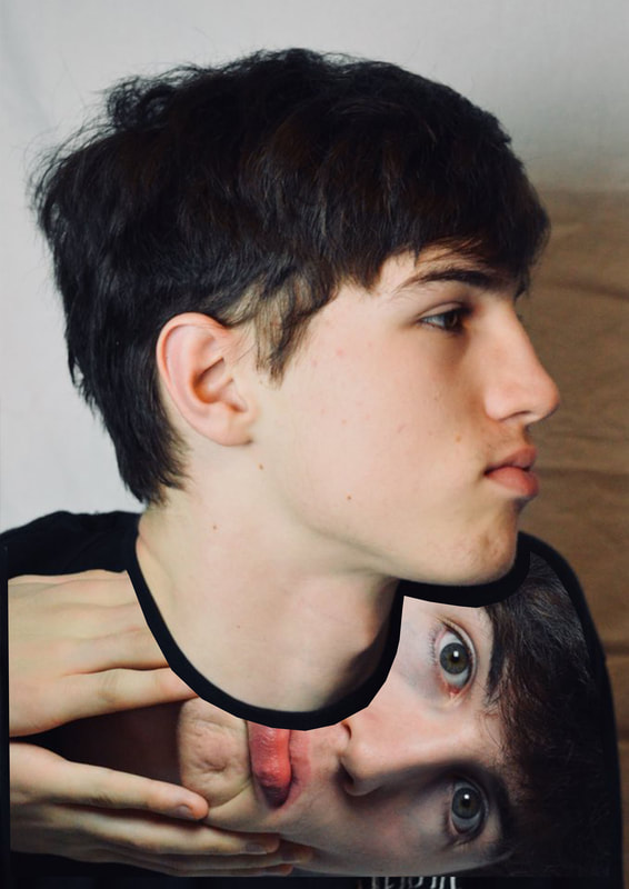
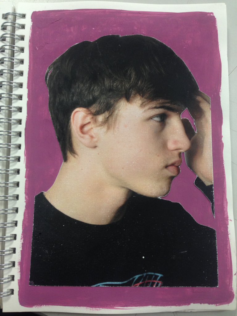
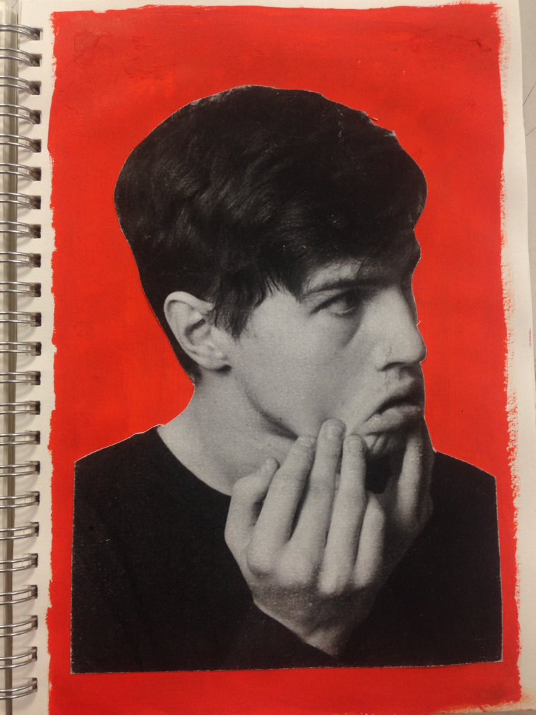
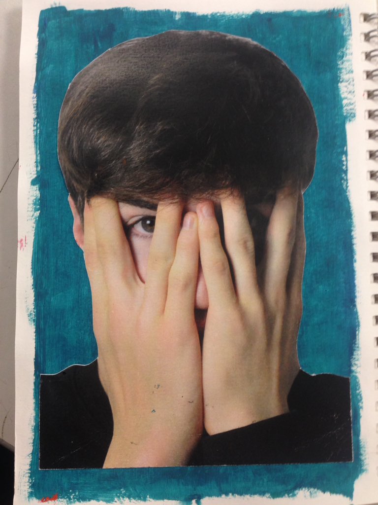
With these edits...
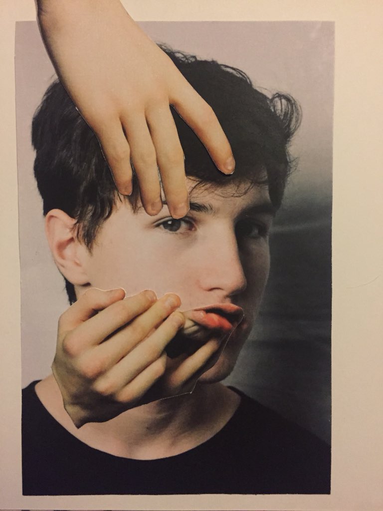
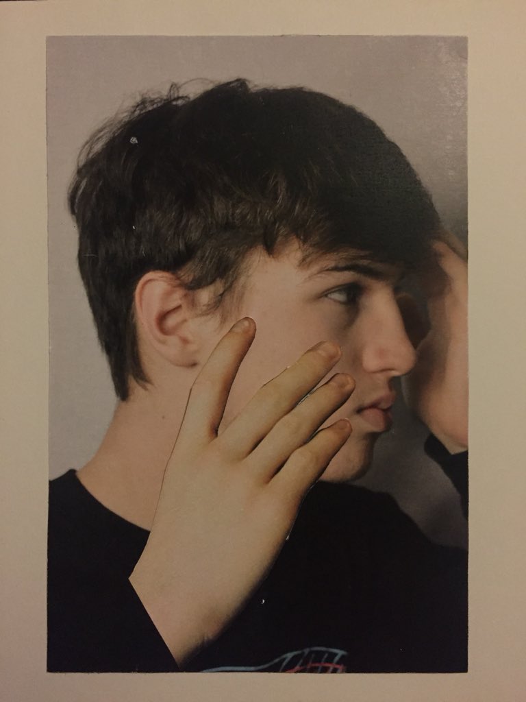
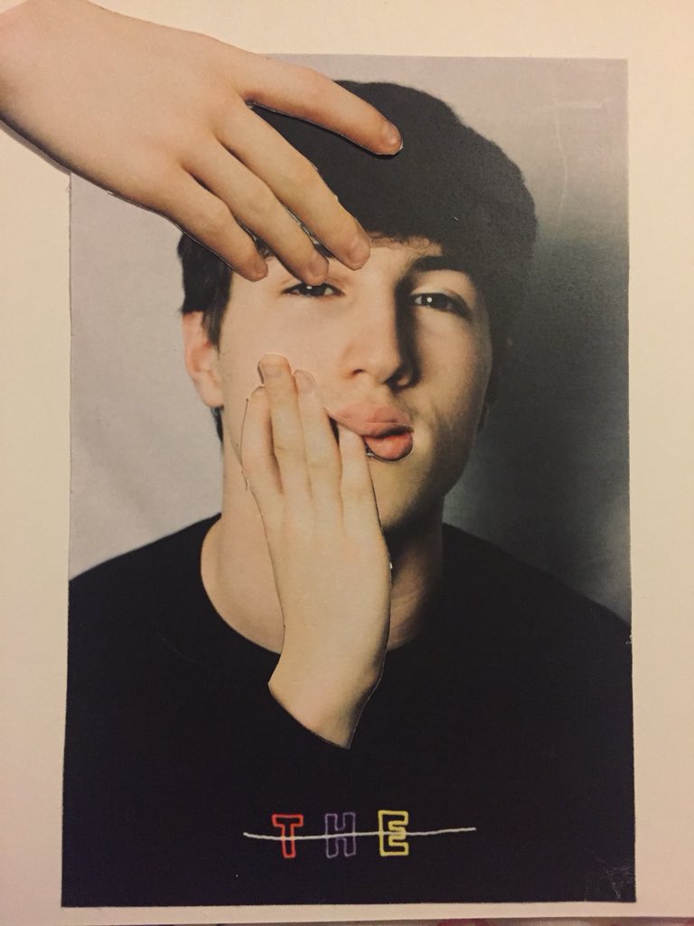
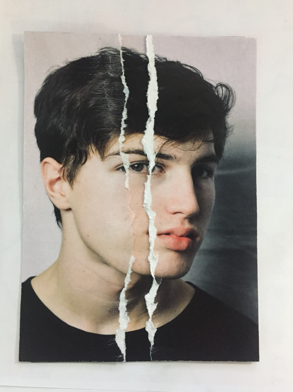
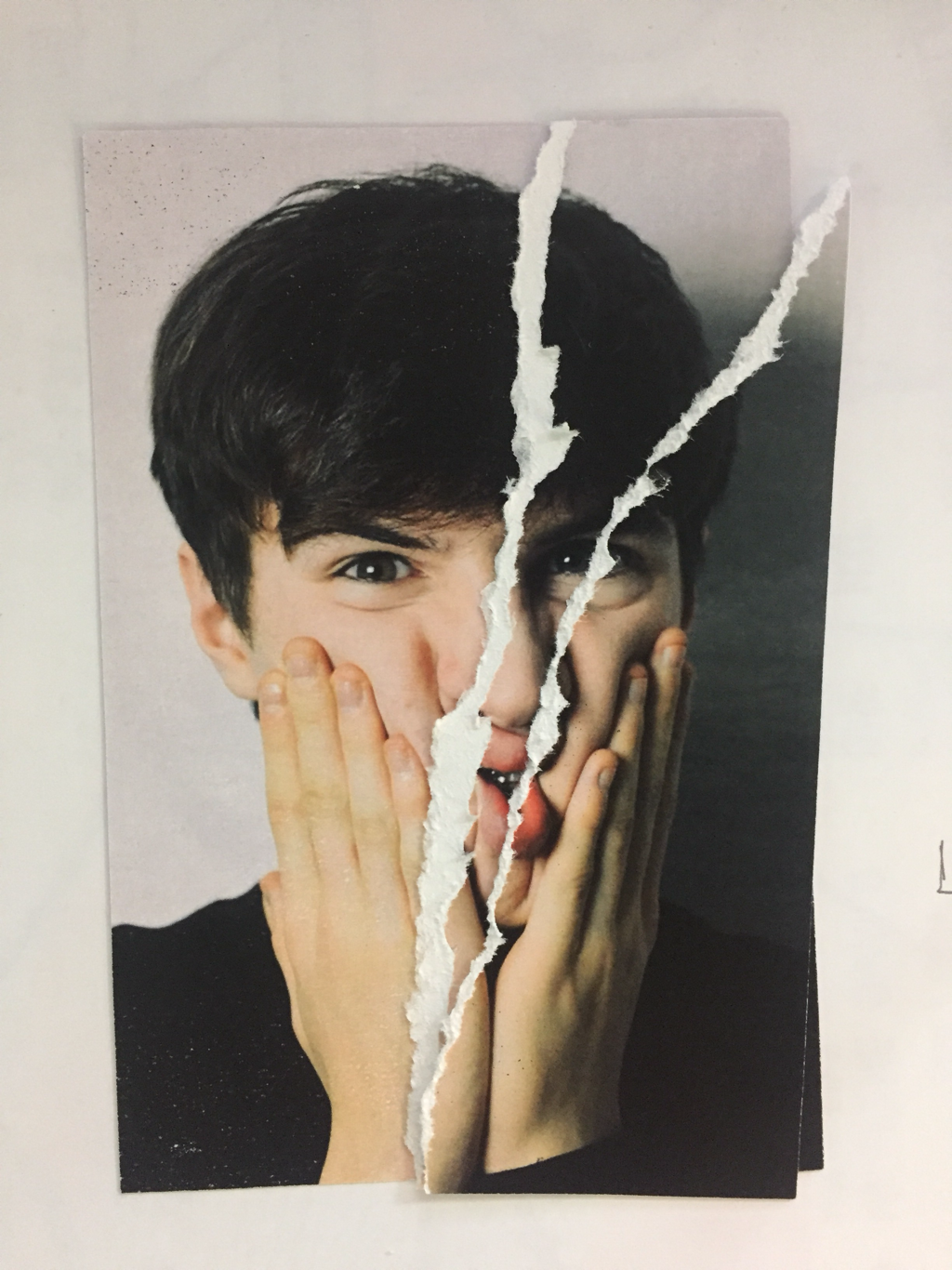
Firstly, I printed the originals onto art paper, then with a cutting knife, cut out hands from various images where the subject had their hands to their face. With the cut out hands, I then arranged them in numerous ways to mimic how Rosanna Jones had done on some of her pieces. The multiple hands on faces illustrate my theme, "Hidden Identity", as it is as though the hands are hiding the face, almost like a metaphor for the person themselves not knowing their true identity.
After placing the images down, I scanned them into Photoshop to edit them into black+white and using the Brush Tool to create the marks over the top of the edited image; again, acting metaphorically as a device to hide ones identity from self and to society.
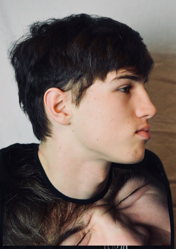
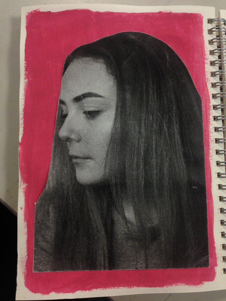
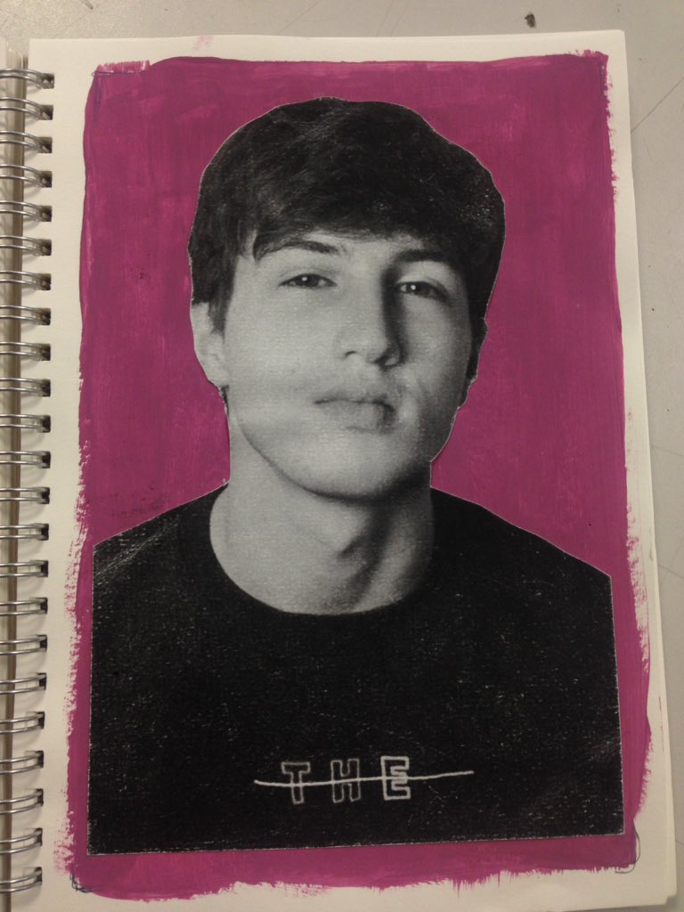
Below are more of the original arrangements.
Firstly, I printed the originals onto art paper, then with a cutting knife, cut out hands from various images where the subject had their hands to their face. With the cut out hands, I then arranged them in numerous ways to mimic how Rosanna Jones had done on some of her pieces. The multiple hands on faces illustrate my theme, "Hidden Identity", as it is as though the hands are hiding the face, almost like a metaphor for the person themselves not knowing their true identity.
After placing the images down, I scanned them into Photoshop to edit them into black+white and using the Brush Tool to create the marks over the top of the edited image; again, acting metaphorically as a device to hide ones identity from self and to society.
Below are more of the original arrangements.
|
|
|
|

|

|

|

|

|
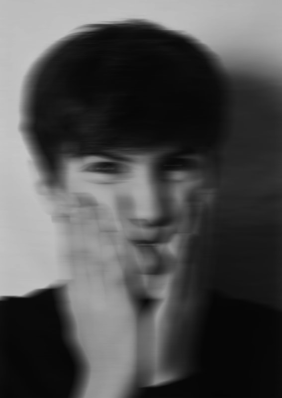
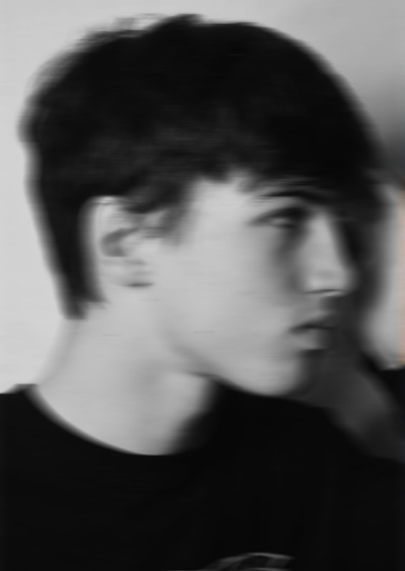
The images below are done using the motoin blur tool in photoshop to mimic Rosanna Jones' images, and changed to black and white.
This tool didn't quite give me the finish I desired, to which I therefore changed the way I created the blurred finish.
This tool didn't quite give me the finish I desired, to which I therefore changed the way I created the blurred finish.

|

|
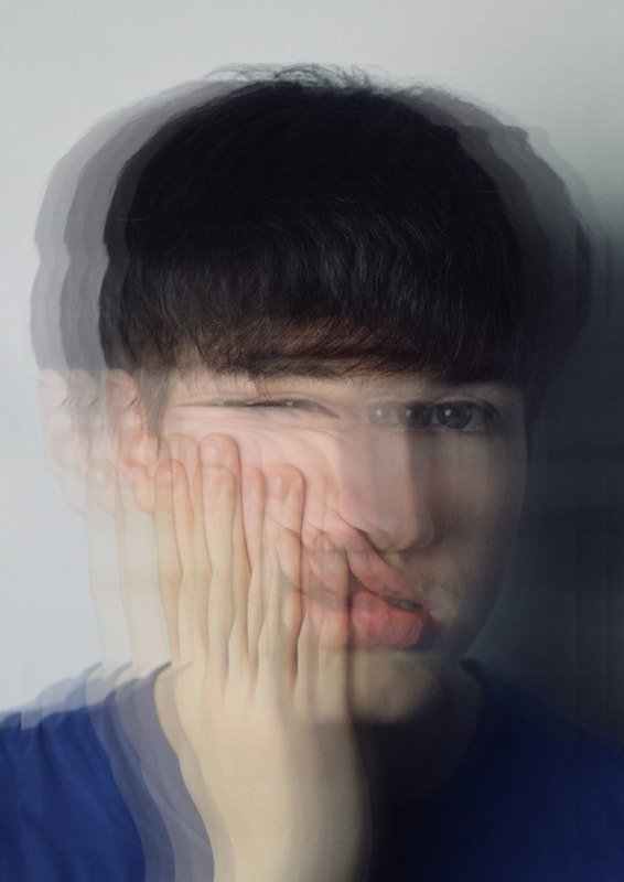
These images are done using Rosanna Jones' tape from her images.
To get the distorted background effect, I used multiple copies of the same image, lowered the opacity on all but one, and placed them all in different places. I also changed the image to black and white, to mimic the idea of Jones'.
I then experimented with my own tape designs.
Below, I expermented with blue tape because of the colour of the top the subject is wearing in my photographs.
I like the way this method turned out. I like that the images are blurred but not blurred so much that you can not see the detail. This blurred effect represents the hope for an individuals identity being revealed; The fact that you can still see the focus of the subject emphasises this.


|

|
Blurred versions of the images above:

Layered portrait without tape.
|

|

|
|
|
|

|

|
|
|

BY HAND:

|

|

PHOTOSHOP
|
|
|
|
|
